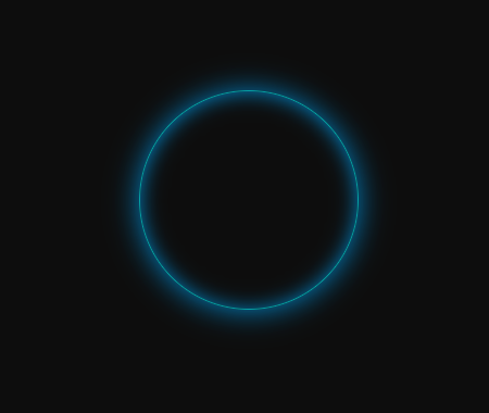
今天无意间用到了呼吸灯效果样式:
css:1
2
3
4
5
6
7
8
9
10
11
12
13
14
15
16
17
18
19
20
21
22
23
24
25
26
27.breathBox {
width: 200px;
height: 200px;
border: 1px solid #2b92d4;
border-radius: 50%;
text-align: center;
margin: 100px auto;
box-shadow: 0 1px 2px rgba(0, 0, 0, 0.3);
overflow: hidden;
animation-timing-function: ease-in-out;
animation-name: breathe;
animation-duration: 1500ms;
animation-iteration-count: infinite;
animation-direction: alternate;
}
@keyframes breathe {
0% {
opacity: 0.4;
box-shadow: 0 1px 2px rgba(0, 147,223,0.4), 0 1px 1px rgba(0, 147, 223, 0.1) inset;
}
100% {
opacity: 1;
border: 1px solid rgba(59, 235, 235, 0.7);
box-shadow: 0 1px 30px #0093df, 0 1px 20px #0093df inset;
}
}
html:1
<div class="breathBox"></div>
